Designing a better mobile banking experience
Client
Case Study, 2019
Role
UX Design, Interaction Design
Tools
Figma, Miro
Introduction
Over the past few years, I’ve banked with 4–5 banks, all for different business or personal purposes. One overarching theme throughout is that their mobile banking experiences were challenging at best. I set out to redesign the mobile banking experience with the modern user in mind.
It should be noted that so far, I have only executed screen designs/prototypes for a proof of concept, not the entire app experience. That’s in the works.
Research
To help set a baseline of features and capabilities, I examined and compared the mobile apps form Wells Fargo, PNC, Chase, and a local credit union. I also compared the features and value propositions of 3rd-Party apps like Venmo and PayPal to identify what makes these 3rd party apps so popular and how can the bank apps serve their users more directly instead of forcing them to use outside integrations.
Goals
- Based on the common themes found and feature priorities clarified, three goals were established.
- Create a quick menu that was consistent across all screens for the most popular tasks.
- Easily lock and unlock the user’s credit/debit card in case of theft or loss.
Streamline mobile experience for modern users and improve information architecture.
User Profile
- Qualifications: Existing mobile banking user, or someone who wants to become one. Wants their mobile banking experience to be customized to their needs.
- Platform: Mobile Devices
- Target age range: 22 – 45
- Gender: all
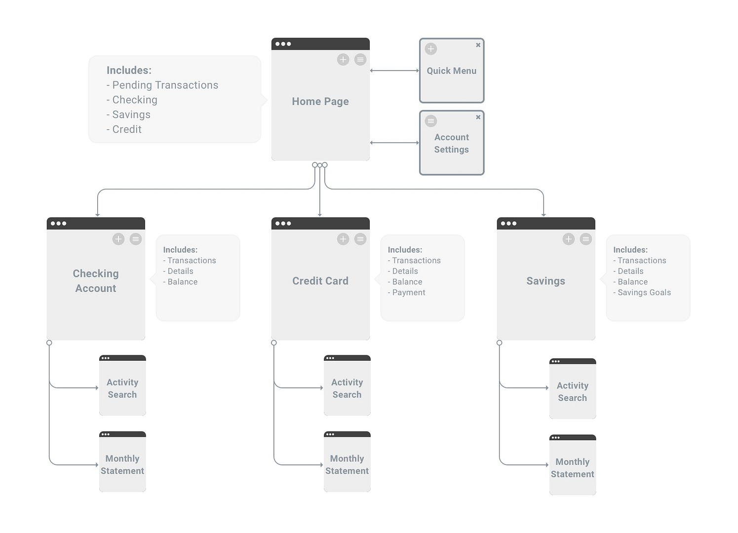
User Flow
Results
Home & Menu
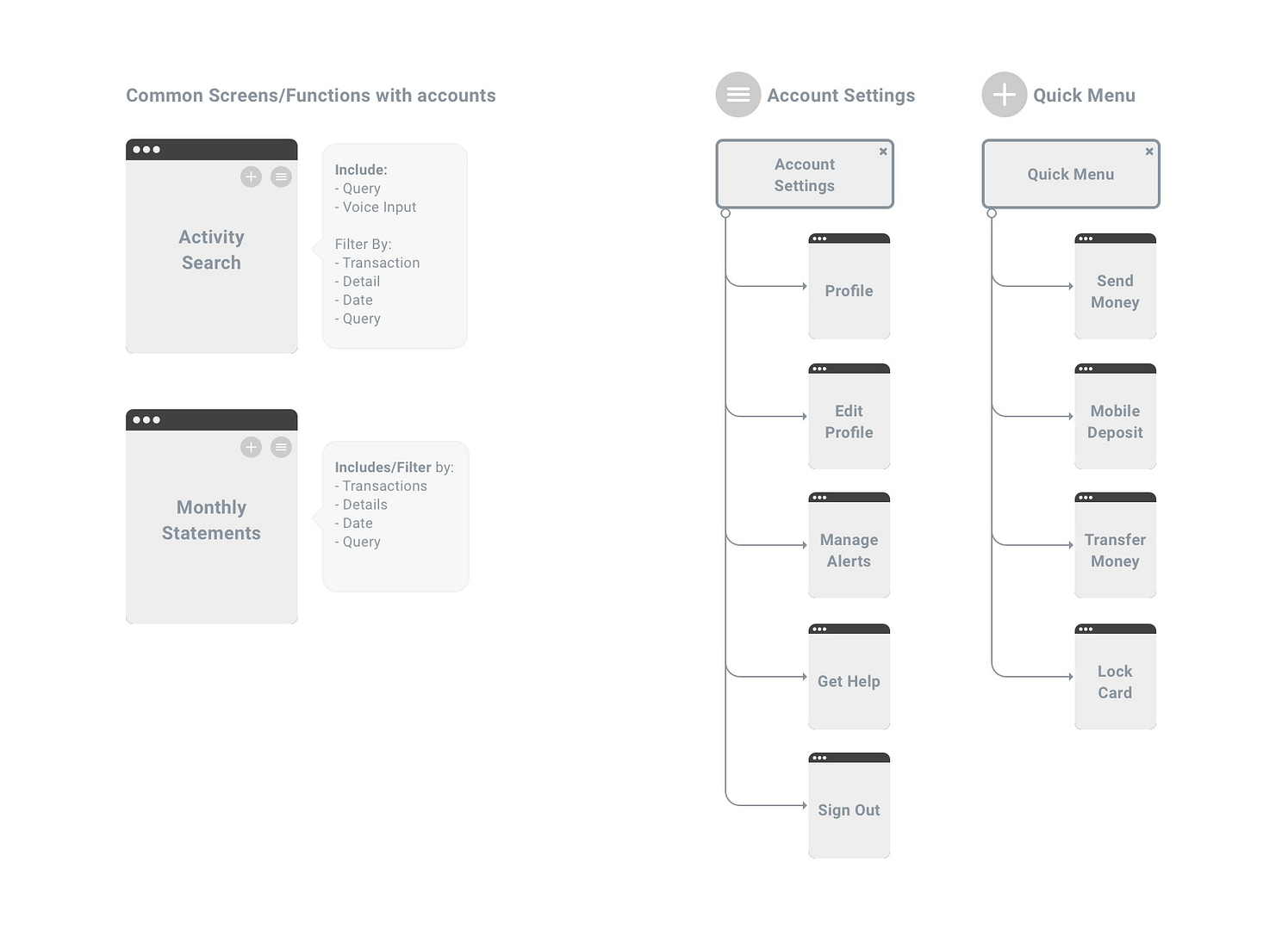
The home screen includes a quick menu that appears on every screen to include the most frequented tasks – ex. Send Money, Mobile Deposits, Transfer Money, and Lock Card. In future iterations, the user could customize those actions since they may not be all the same.
The individual cards have clearly displayed the balance of each account so users don’t have to guess or go to an additional screen. They can also lock any of their cards by swiping to the left if the card gets lost or stolen.
The account menu is where many of the preferences, customer service, and alerts are housed and can be easily accessed on each screen in the app.

Individual Account Detail
The information architecture update on these screens was especially critical because many of the apps reviewed had issues prioritizing account balances and activity. These screens now display the account balance and pending withdraws at the top and, where applicable, a Make a Payment CTA.
The bottom half of the screen reveals recent activity. When the user pulls up on the drawer, it reveals the transactions in detail, including accessing monthly statements.

Prototype Walkthrough
Below is a walkthrough of the prototype, created in Figma, including all of the user experience enhancements listed above.
